
PROPA
Rebranding
2024
Propa is a Barcelona-based prop hire company specializing in furniture and prop rentals for the film, TV, photography and entertainment industries.
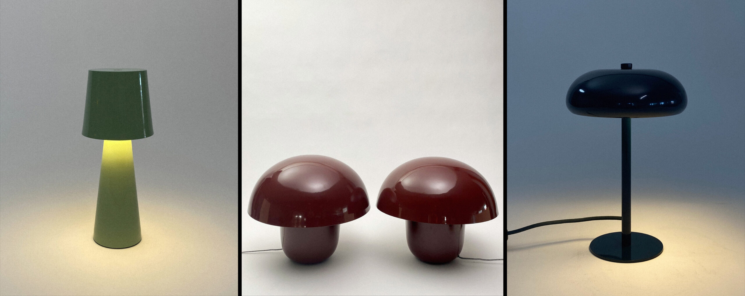
Founded by professionals with over 25 years of experience in the global film and TV industry, Propa was born in the art department itself and offers an eclectic selection of props with an ever-growing collection, from furniture to seasonal props, accessories and surfaces for tabletop shooting.
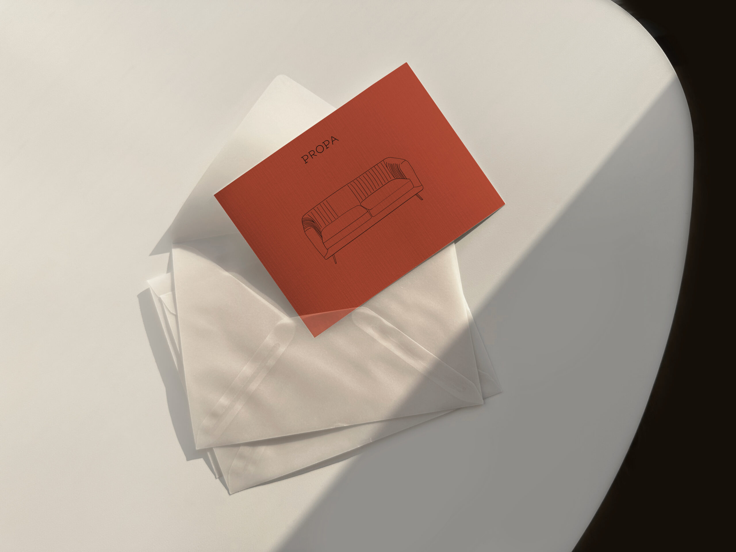
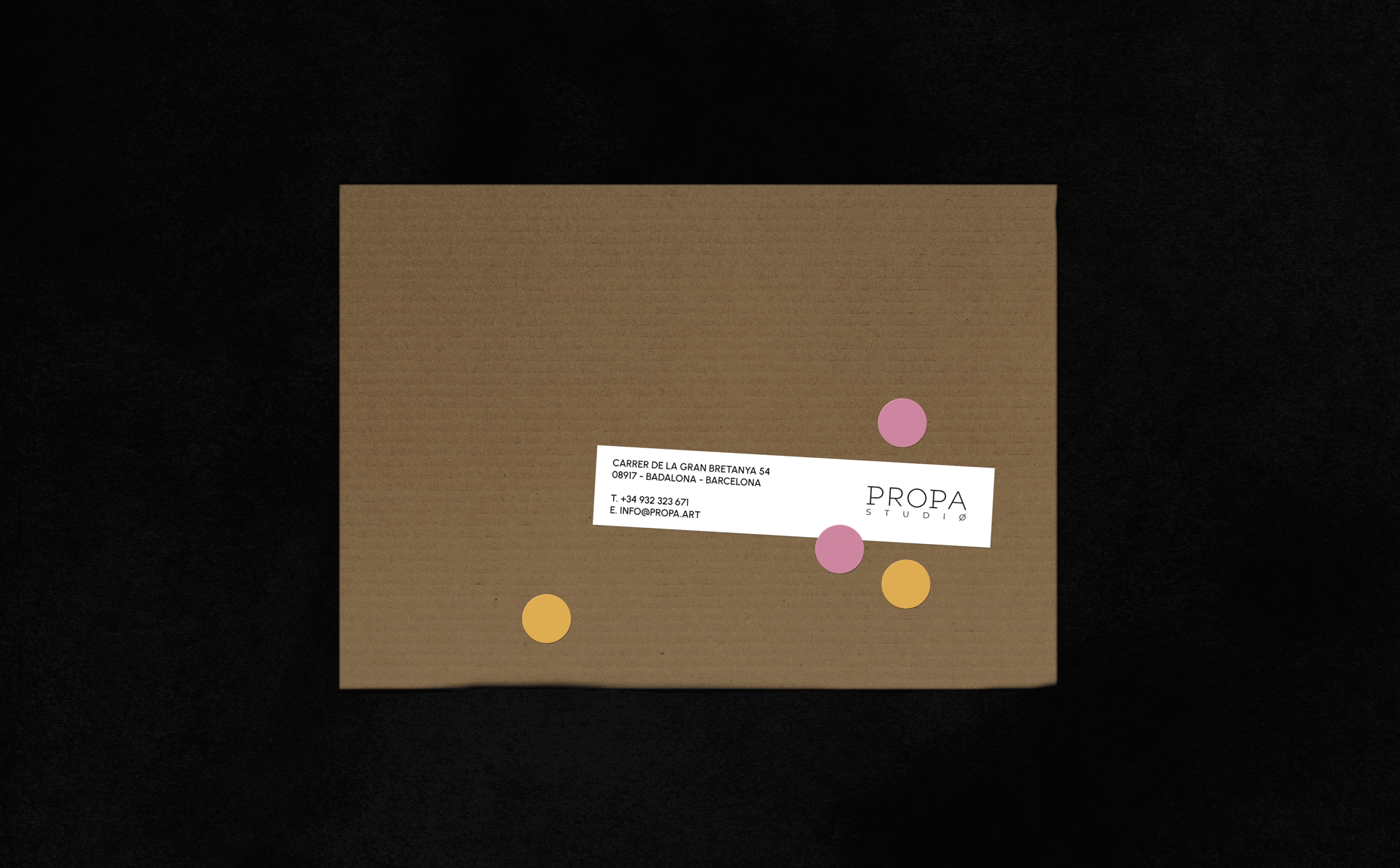
The main idea behind the refreshed brand identity is to emphasize the abundance and variety of props. The fun and welcoming rebranding was achieved by expanding the existing palette with new bold colors and adding new graphic elements.
With a range of props ready to compose distinct set designs, Propa’s aim is to offer a fast and efficient quality service to their art department comrades.
The main idea for this rebrand is to show the variety and multiplicity of props.
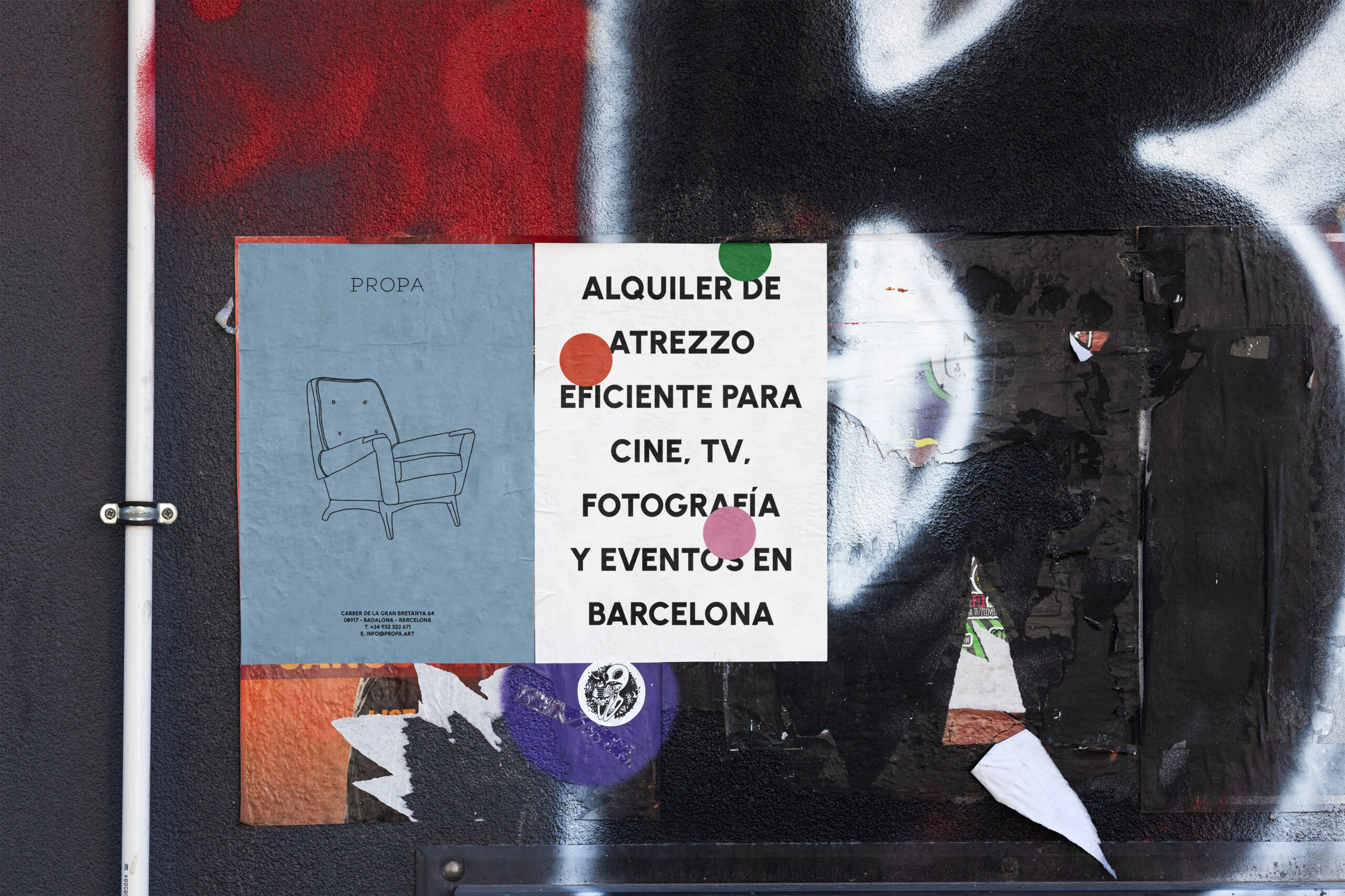
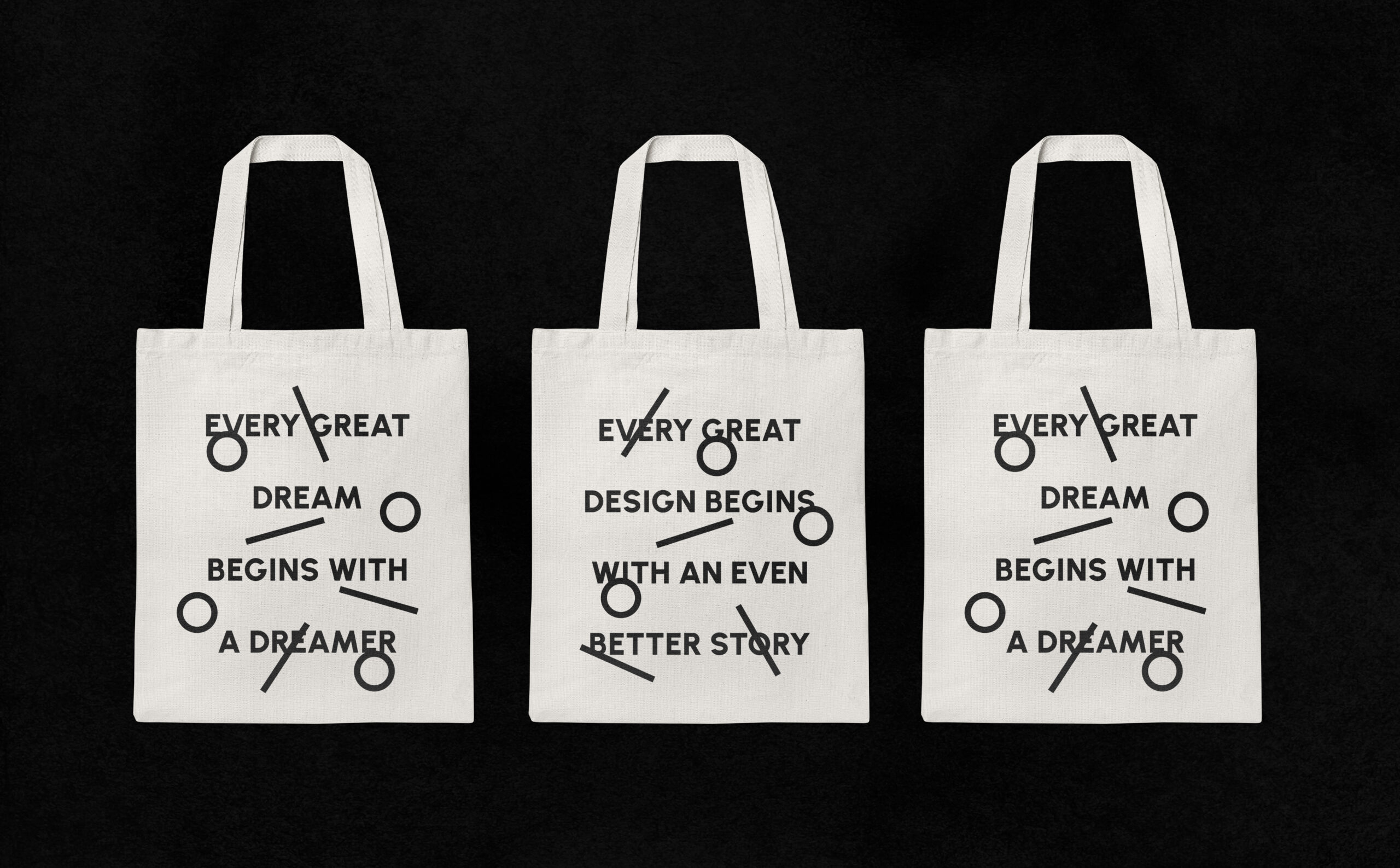
For this, the lines and shapes used in the logo formed a new visual identity. Straight lines, circles as well as solid rectangles and circles were used as graphic elements to enhance the visual identity.
We expanded the main monochrome palette with additional five bold colors.
A geometric sans serif with a modernist atmosphere was chosen as a primary brand typeface. to balance the bold main typography, the handwriting style typeface was chosen as an accent font.

PROPA
Rebranding
2024
Propa is a Barcelona-based prop hire company specializing in furniture and prop rentals for the film, TV, photography and entertainment industries.
Founded by professionals with over 25 years of experience in the global film and TV industry, Propa was born in the art department itself and offers an eclectic selection of props with an ever-growing collection, from furniture to seasonal props, accessories and surfaces for tabletop shooting.
The main idea behind the refreshed brand identity is to emphasize the abundance and variety of props. The fun and welcoming rebranding was achieved by expanding the existing palette with new bold colors and adding new graphic elements.


With a range of props ready to compose distinct set designs, Propa’s aim is to offer a fast and efficient quality service to their art department comrades.
The main idea for this rebrand is to show the variety and multiplicity of props.
For this, the lines and shapes used in the logo formed a new visual identity. Straight lines, circles as well as solid rectangles and circles were used as graphic elements to enhance the visual identity.
We expanded the main monochrome palette with additional five bold colors.
A geometric sans serif with a modernist atmosphere was chosen as a primary brand typeface. to balance the bold main typography, the handwriting style typeface was chosen as an accent font.


PROPA
Rebranding
2024
Propa is a Barcelona-based prop hire company specializing in furniture and prop rentals for the film, TV, photography and entertainment industries.
Founded by professionals with over 25 years of experience in the global film and TV industry, Propa was born in the art department itself and offers an eclectic selection of props with an ever-growing collection, from furniture to seasonal props, accessories and surfaces for tabletop shooting.
The main idea behind the refreshed brand identity is to emphasize the abundance and variety of props. The fun and welcoming rebranding was achieved by expanding the existing palette with new bold colors and adding new graphic elements.


With a range of props ready to compose distinct set designs, Propa’s aim is to offer a fast and efficient quality service to their art department comrades.
The main idea for this rebrand is to show the variety and multiplicity of props.
For this, the lines and shapes used in the logo formed a new visual identity. Straight lines, circles as well as solid rectangles and circles were used as graphic elements to enhance the visual identity.
We expanded the main monochrome palette with additional five bold colors.
A geometric sans serif with a modernist atmosphere was chosen as a primary brand typeface. to balance the bold main typography, the handwriting style typeface was chosen as an accent font.